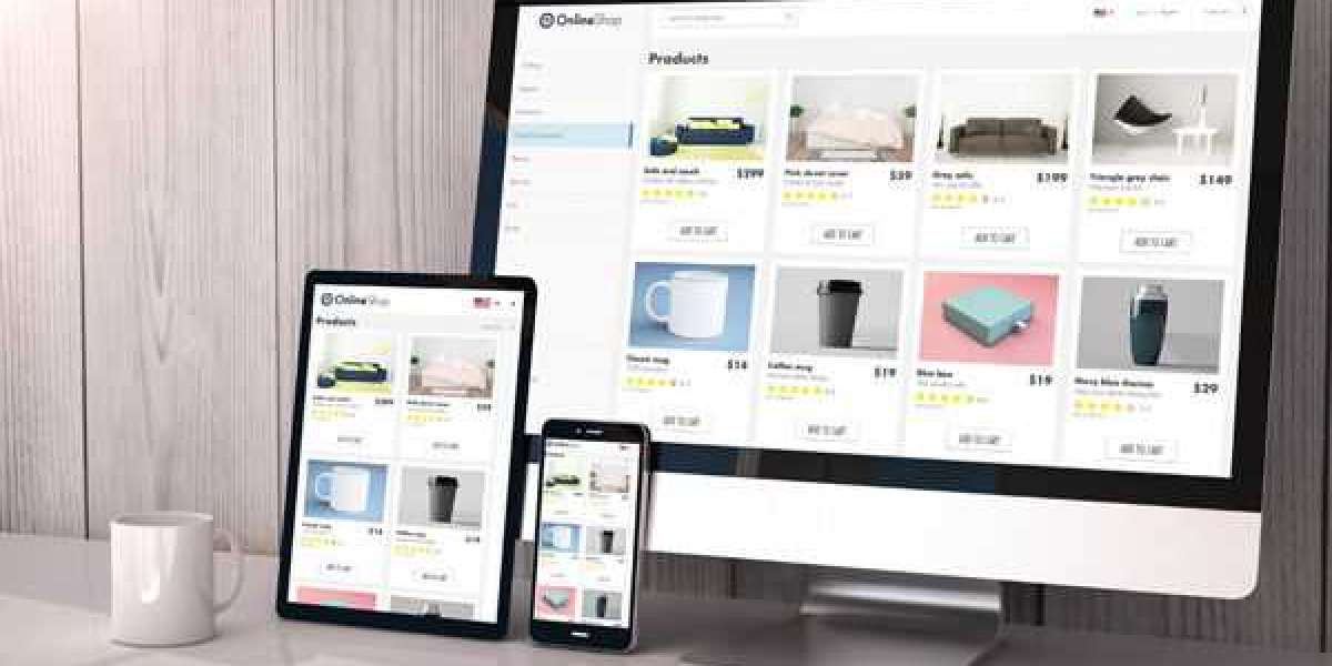
When running an online store, it’s one thing to get potential customers to the checkout page. It’s another to get them to complete the purchase. This is where shopping cart design matters. A well-designed cart can significantly impact conversion rates, helping turn visitors into buyers.
What is Conversion Rate?
Conversion rate refers to the percentage of website visitors who complete a purchase compared to those who don’t. A higher conversion rate means more sales, while a lower conversion rate shows visitors are leaving without completing their purchase. Optimizing your Shopping Cart Web Design can improve this rate and lead to more successful transactions.
Let’s explore how shopping cart web design can improve conversion rates.
1. Simplified and Clean Layout
A cluttered shopping cart can overwhelm shoppers. This often leads to abandoned carts. A simple, clean design makes the cart easier to use. Product images, quantities, and prices should be clearly visible. Make sure your cart layout matches your website’s overall theme for a smooth experience.
Example:
Amazon’s shopping cart is simple and easy to use. The layout is clear, with product images, prices, and an easy-to-find checkout button. This simplicity helps encourage shoppers to finish their purchase.
2. Visible Total Costs
Unexpected costs are a major reason customers abandon carts. This includes taxes, shipping, and handling fees. Be upfront about all costs. Show the total price—including taxes and shipping early in the process. This avoids surprise charges at checkout.
Example:
Zappos displays estimated delivery dates and shipping costs early in the cart process. This transparency reduces cart abandonment and encourages shoppers to continue.
3. Progress Indicators
Customers like to know where they are in the checkout process. A progress bar can reduce anxiety and keep them on track. A simple "Step 1 of 3" or "Your Cart Payment Confirmation" helps customers see how many steps are left.
Example:
Apple’s online store uses a progress bar. It clearly shows how far along customers are in the checkout process. This helps shoppers feel confident in finishing their purchase.
4. Guest Checkout Option
Forcing customers to create an account before buying can turn them away. Some customers prefer a quick purchase without registering. Offering guest checkout makes the process faster and easier, leading to fewer abandoned carts.
Example:
Etsy lets customers check out as guests. This option is simple and convenient, removing the barrier of registration. It’s one less step to worry about.
5. Trust Signals
Online shoppers worry about fraud and privacy. Including trust signals like security badges and payment icons helps reassure customers. These signals let them know their information is safe. Trust signals help reduce cart abandonment and boost conversions.
Example:
PayPal is often displayed as a payment option. Its reputation for secure transactions gives customers peace of mind. Including well-known payment options can help increase trust and conversions.
6. Mobile Optimization
Many customers shop on their phones. If your shopping cart isn’t mobile-friendly, you’ll lose sales. Make sure your cart design works well on all devices. It should load quickly, be easy to navigate, and be responsive to different screen sizes.
Example:
ASOS has a responsive shopping cart that works well on both desktop and mobile devices. The experience remains smooth, no matter what device you’re using.
7. Simple, Visible Call to Action (CTA) Buttons
Your CTA buttons should stand out. Phrases like "Proceed to Checkout" or "Update Cart" should be easy to find. Use contrasting colors to make the buttons more noticeable. Clear CTA buttons encourage users to take the next step in the checkout process.
Example:
Walmart’s checkout button is large and bright, making it easy to see. This simple design encourages customers to continue with their purchase.
8. Customer Reviews and Social Proof
Customer reviews and ratings can build trust. Adding these to your shopping cart helps reassure customers that they’re making a good decision. Social proof can lead to higher conversion rates, especially for new customers.
Example:
Best Buy shows customer ratings and reviews in the shopping cart. This social proof helps encourage people to complete their purchase.
9. Retargeting and Cart Reminders
When a customer abandons their cart, sending a reminder email can bring them back. Cart abandonment emails often show the items left behind and sometimes offer discounts or free shipping. Retargeting ads can also remind shoppers about their cart.
Example:
Target sends reminder emails with images of the items left behind. This simple tactic can lead to higher conversion rates by making it easy for customers to return to their cart.
10. Limited-Time Offers and Urgency
Adding urgency can push customers to act quickly. Show limited-time offers or countdown timers in the cart. Letting customers know that a sale is ending soon can motivate them to complete their purchase.
Example:
Booking.com displays messages like "Only 2 rooms left at this price!" This creates a sense of urgency, encouraging customers to book immediately.
Conclusion
Shopping cart web design plays a pivotal role in improving conversion rates. A clean, simple layout, clear visibility of costs, trust signals, and mobile optimization are all key elements that can help reduce cart abandonment and increase sales. Small design tweaks can make a big difference in turning visitors into paying customers.


