

Think about your favorite space maybe it’s a sunlit café where you always linger over coffee, or a quiet hotel room where you slept better than you have in months. Chances are, you didn’t fall in love with it because of the sofa’s price or the shelf layout. You fell in love with how the room made you feel.
And often, that feeling starts with color.
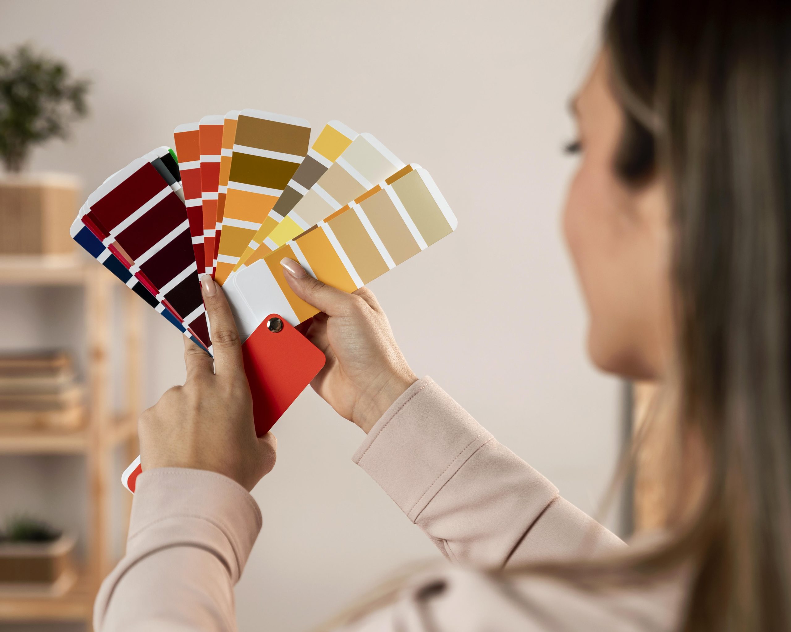
Before your eyes even register the furniture, your brain is already reacting to the shades on the walls, the warmth of the wood, and the way light moves through the space. Yet, when it comes to our own homes, we usually pick palettes by squinting at fifty near-identical paper swatches under harsh store lighting and hoping for the best.
As any experienced interior design company will tell you, choosing the right colors isn’t about chasing whatever shade is trending this year. It’s about matching a room’s emotional temperature to how you actually live in it, at 8 AM, at 3 PM, and at 10 PM.
Here is how to look beyond basic paint chips and choose a palette that supports your daily life.
The Living Room: Warmth, Texture, and Connection
Your living room wears a lot of hats. It’s where you host friends, unwind after a long day, and spend slow Sunday afternoons. Because it’s a shared space, the goal here is warmth and balance and that doesn’t just come from wall paint.
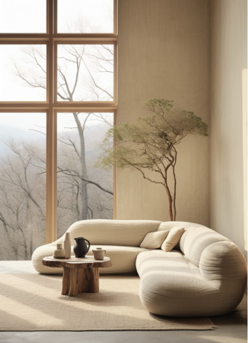
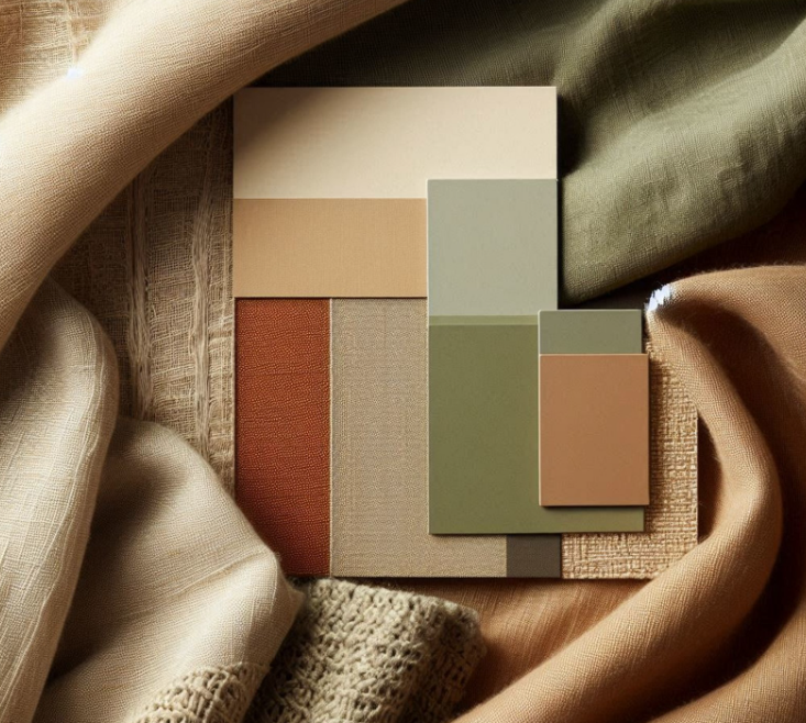
- What works best: Warm neutrals like taupe, soft greige, or creamy off-white create a welcoming backdrop. If you want more personality, muted terracotta, warm olive, or soft sage green bring an earthy, grounded energy that makes people want to linger.
- Think in materials, not just paint: Color looks completely different on different surfaces. A flat, stark white wall can feel sterile, whereas a warm off-white in a matte limewashes or paired with raw wood, linen upholstery, and brushed brass instantly feels rich and lived in.
- Real-world shift: In compact apartments, homeowners often paint everything bright white, thinking it will make the room look bigger. Intense afternoon sunlight can make stark white feel glaring, while shadowed corners turn dingy. Swapping to a warm greige softens the room’s edges, making it feel more expansive and cohesive.
The Bedroom: Your Personal Reset Button
If your living room is for connection, your bedroom is for restoration. When you walk in at the end of the day, your nervous system should immediately get the message that it’s time to slow down.
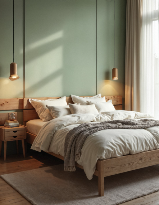
- What works best: Cool, muted tones are your best friends here. Soft blues, dusty lavender, muted eucalyptus green, and warm, cozy whites naturally help lower your heart rate and quiet a busy mind.
- Watch your bulb temperature: Even the most calming paint color can feel jarring if your lighting is wrong. A cool sage or dusty blue wall under a harsh, cool-white 4000K bulb at night will feel clinical. Pair your bedroom palette with warm 2700K bulbs so the room wraps you in a soft, restful glow after sunset.
The Kitchen & Dining Area: Energy and Appetite
People always end up gathered in the kitchen, even when there’s a perfectly good living room ten feet away. It’s the heart of the home a place of movement, conversation, and nourishment.
- What works best: Warm, inviting tones like buttery yellow, earthy ochre, or crisp white paired with natural wood accents keep the space feeling bright and social. Deep navy or forest green on lower cabinets can also add a rich, timeless anchor without overwhelming the room.
- The finish matters: Satin or semi-gloss finishes work wonders in kitchens—they’re easy to wipe down and bounce natural light around, keeping the space feeling fresh and clean.
The Home Office: Focus Without the Fatigue
Whether you work from home full-time or need a quiet corner to manage life’s admin, your workspace needs to help you concentrate without draining your energy.
- What works best: Sage green is a quiet hero for home offices; it’s easy on the eyes and reduces visual fatigue during long, screen-heavy days. Muted blues also encourage steady focus, while warm charcoal can make a space feel grounded and sharp.
- Getting the light right: Working with home design experts can help you match the right wall undertone to your desk placement and window direction, so you don’t end up with harsh screen glare at noon or a room that feels like a cave by 4 PM.
The Bathroom: Everyday Calm
Bathrooms are often the smallest rooms in the house, which makes them the easiest place to create a little daily luxury. Think less “clinical” and more “quiet spa.”
- What works best: Crisp whites, pale aqua, seafoam green, or warm stone greys instantly make a compact bathroom feel airy, clean, and relaxing, especially when paired with textured tiles or matte black and brass fixtures.
Three Mistakes That Trip Almost Everyone Up
Even when you know the psychology behind the colors, a few practical missteps can throw off the whole room:
- Ignoring your local climate and sunlight: Intense, direct afternoon sun will wash out pale pastels and make bright whites feel blinding. On the flip side, overcast or monsoon days can make cool greys look flat and dreary. Always judge a color in the actual light your home gets.
- Trusting tiny paint chips: Never commit to a wall color from a two-inch paper square. Paint a large poster board or a patch directly on the wall, and look at it in the morning, afternoon, and under artificial light at night.
- Forgetting how rooms flow together: In open-concept homes, each room shouldn’t feel like a completely different planet. A skilled interior styling company or interior design solutions company looks at the whole picture, ensuring that as you walk from the hallway into the living room and kitchen, the colors and materials feel like chapters of the same story.
Designing a Home That Feels Like You
At the end of the day, color psychology isn’t a strict set of rules; it’s a toolkit. The best palette for your home is the one that makes you exhale a little deeper when you walk through the front door.
If you’re standing in front of a wall of paint swatches feeling overwhelmed, you don’t have to figure it out alone. Partnering with a thoughtful interior design company takes the guesswork out of the process, helping you blend color, light, and texture into a space that feels effortlessly like yours.